Matplotlib Modern Style
TLDR;
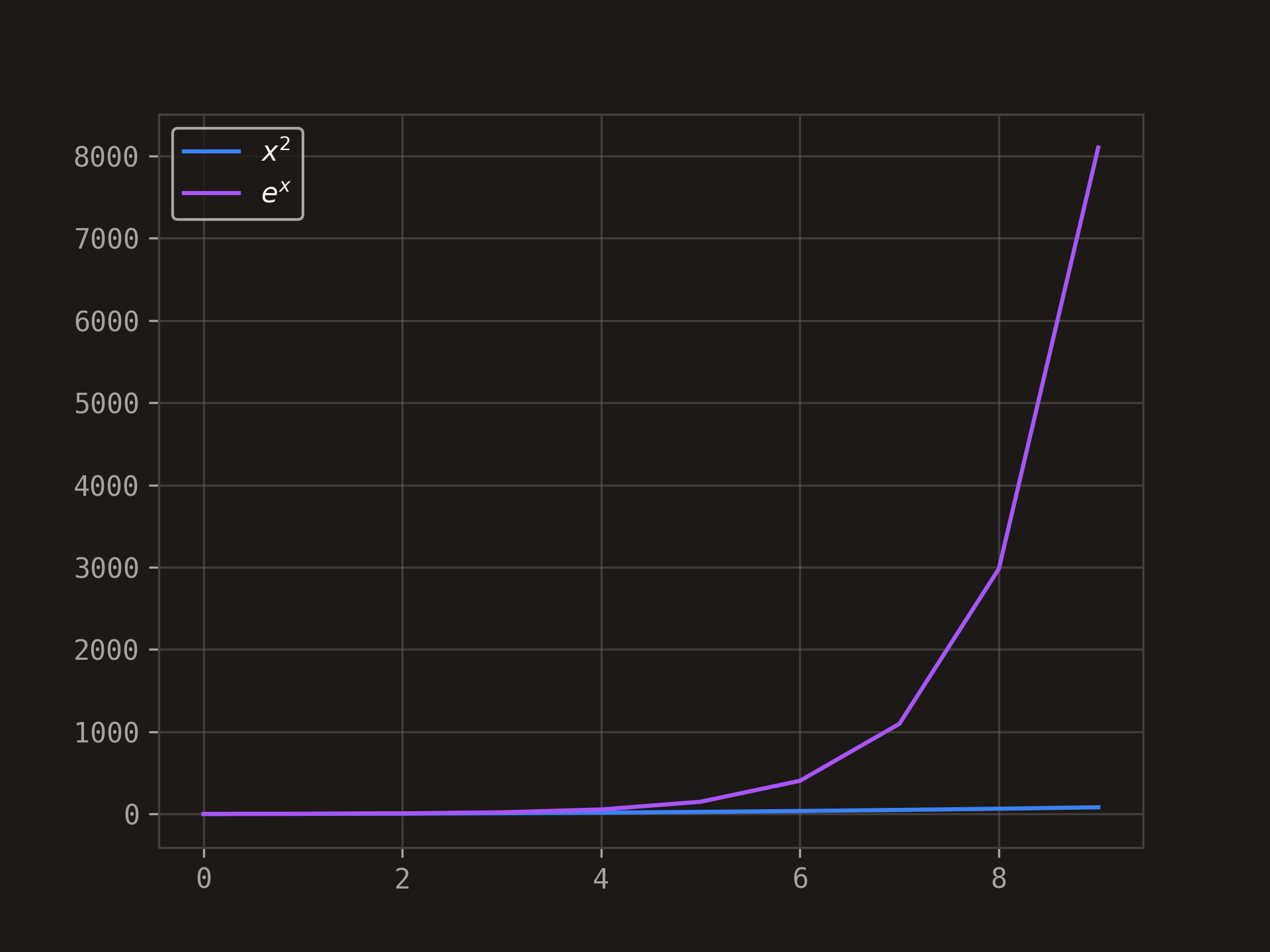
Would you like that your plots in python to look like this?
copy paste into your python project or notebook:
import matplotlib.pyplot as plt
plt.style.use('https://pltstyle.s3.eu-west-1.amazonaws.com/zinc.mplstyle')
More Details About This Styling
Matplotlib is an amazing library 😎. It has always made me wonder how it works under the hood.
It is part of nearly every data science project, university exercise, etc...
However I have a problem with it...
When working on a Data Science project:
- after reading countless machine learning papers,
- training a model for 50 hours
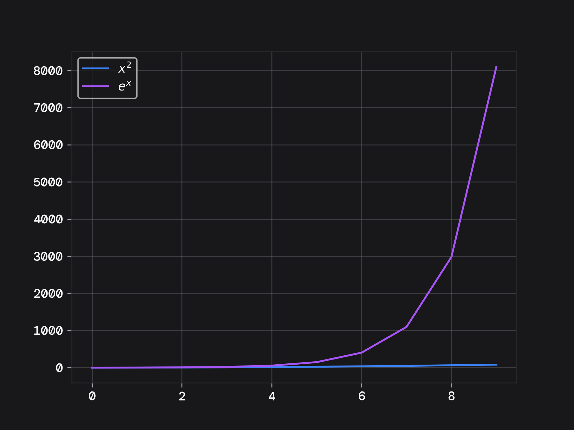
I find it underwhelming to show the output like this:
I wanted something more modern looking or futuristic.
When searching on the internet
I got redirected to seaborn, which also did not satisfy my requirements.
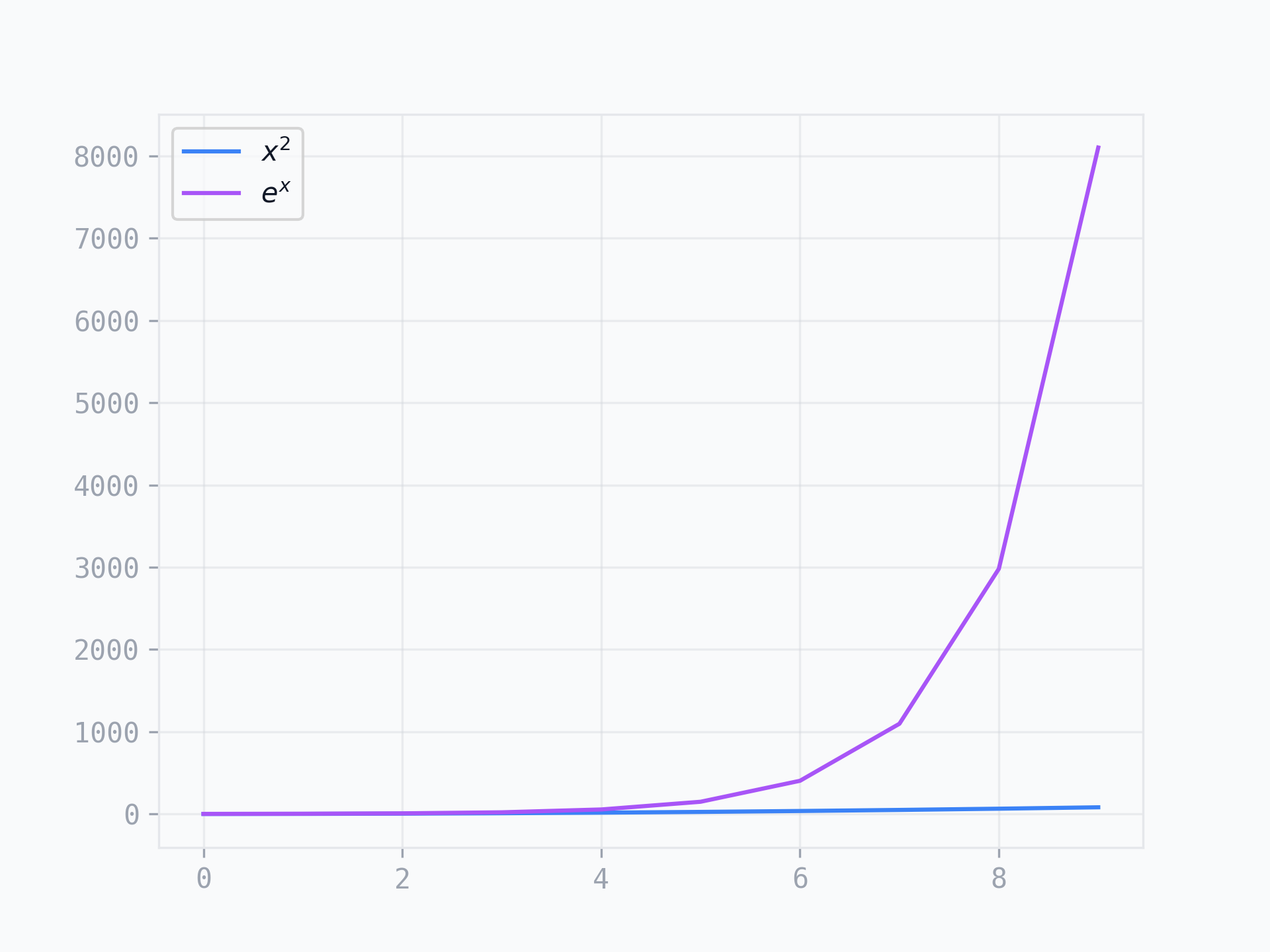
That is the reason why I crafted 10 matplotlib stylesheets.
I really like the colors that tailwind, picked for their color pallette, so I used the same colors for the matplotlib stylesheets.
Here are some plot examples of how this looks:
I generated most of these plots with chatgpt, so don't judge based on the creativity.
Examples
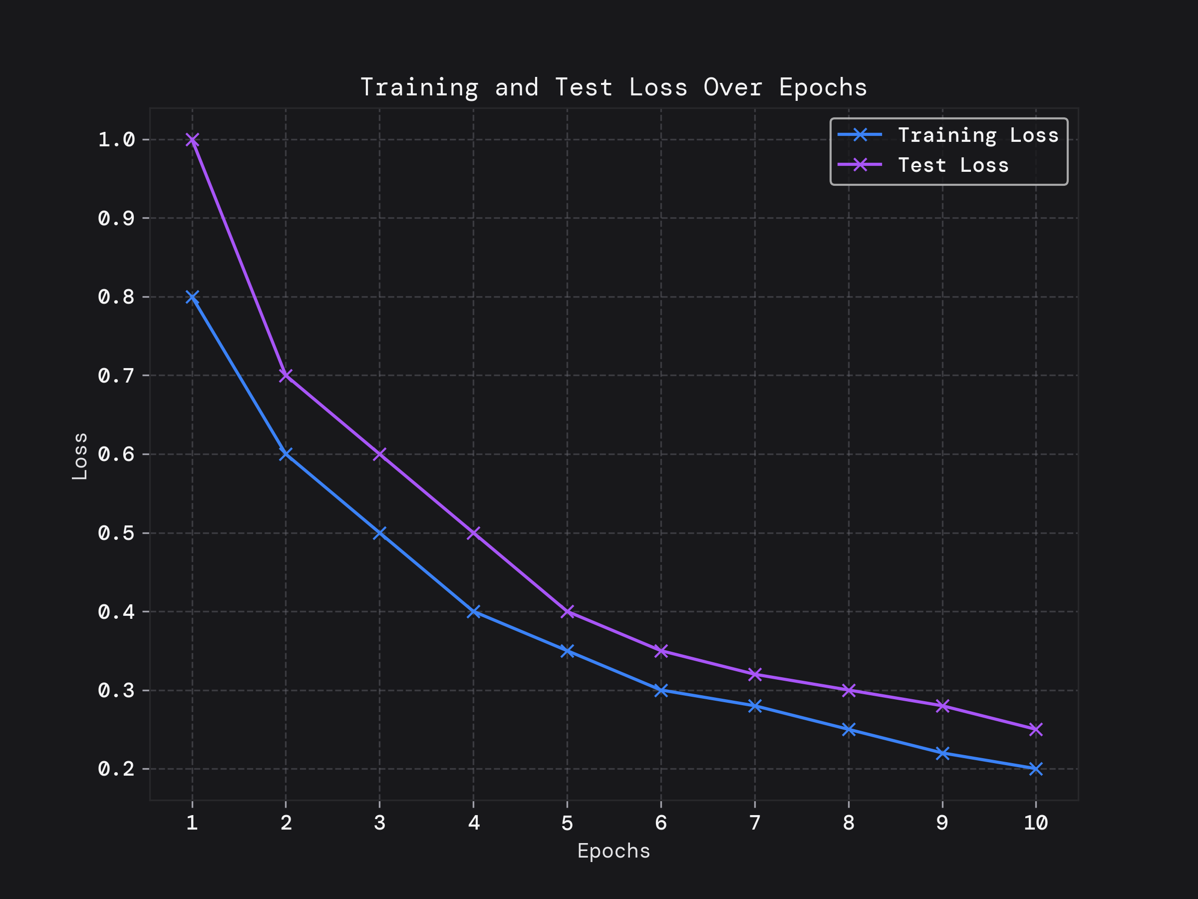
Line Chart
show the train and test loss in a visually appealing way.
import numpy as np
import matplotlib.pyplot as plt

epochs = range(1, 11)
training_loss = [0.8, 0.6, 0.5, 0.4, 0.35, 0.3, 0.28, 0.25, 0.22, 0.2]
test_loss = [1.0, 0.7, 0.6, 0.5, 0.4, 0.35, 0.32, 0.3, 0.28, 0.25]

# Plotting the line plot
plt.figure(figsize=(8, 6))
plt.plot(epochs, training_loss, marker='x', linestyle='-', label='Training Loss')
plt.plot(epochs, test_loss, marker='x', linestyle='-', label='Test Loss')

# Adding labels and title
plt.title('Training and Test Loss Over Epochs')
plt.xlabel('Epochs')
plt.ylabel('Loss')
plt.xticks(epochs)  # Ensure all epochs are shown on x-axis
plt.legend()  # Show legend

# Adding gridlines for better readability
plt.grid(True, linestyle='--')

# Display the plot
plt.savefig('training.png')
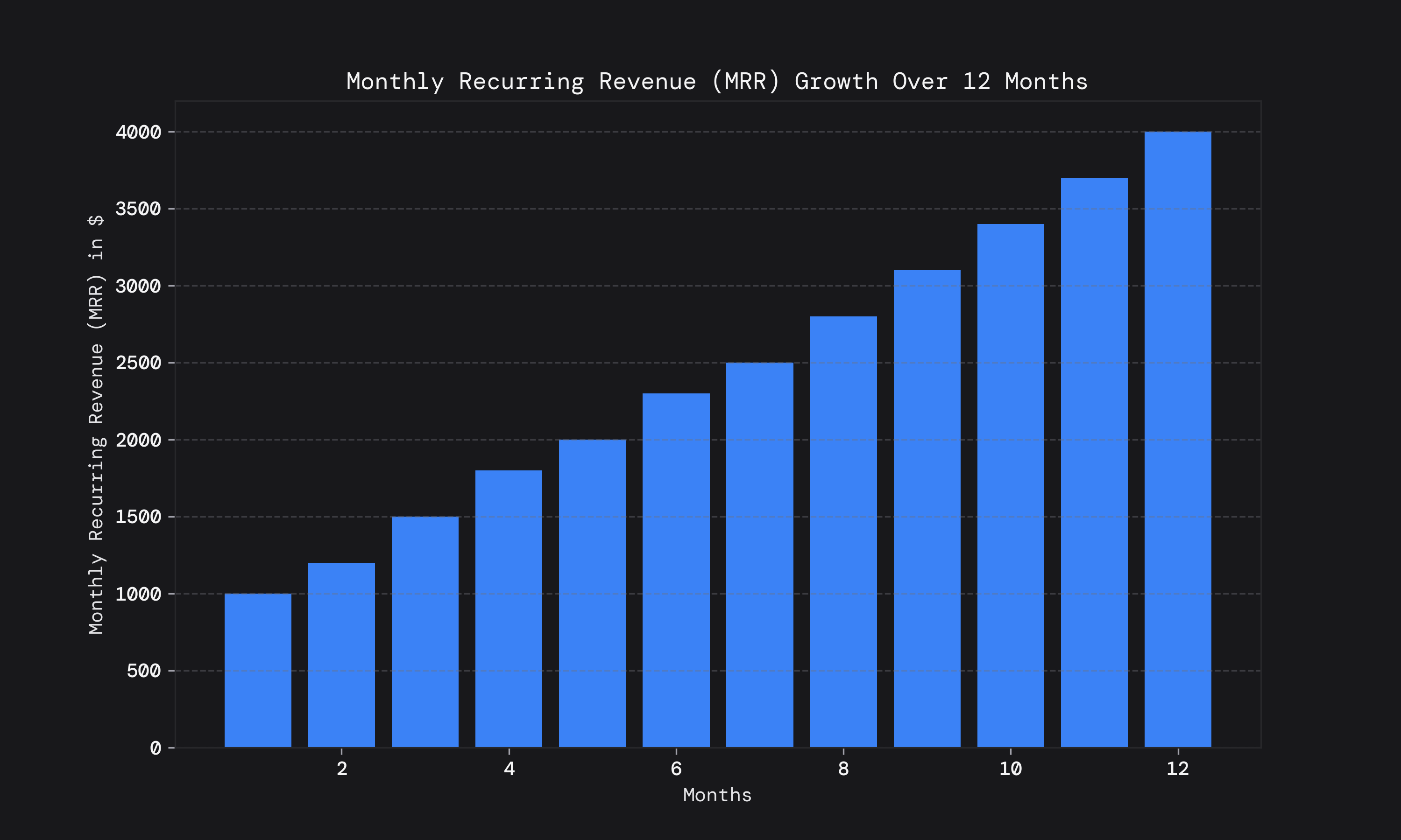
Bar chart.
show off the fake monthly recurring revenue.
import numpy as np
import matplotlib.pyplot as plt

# Generate some example data for Monthly Recurring Revenue (MRR) over 12 months
months = np.arange(1, 13)
mrr = np.array([1000, 1200, 1500, 1800, 2000, 2300, 2500, 2800, 3100, 3400, 3700, 4000])

# Plotting the bar chart
plt.figure(figsize=(10, 6))
plt.bar(months, mrr)

# Adding labels and title
plt.title('Monthly Recurring Revenue (MRR) Growth Over 12 Months')
plt.xlabel('Months')
plt.ylabel('Monthly Recurring Revenue (MRR) in $')

# Adding gridlines for better readability
plt.grid(axis='y', linestyle='--')

# Display the plot
plt.show()
Scatter Plot
the classic iris dataset features.
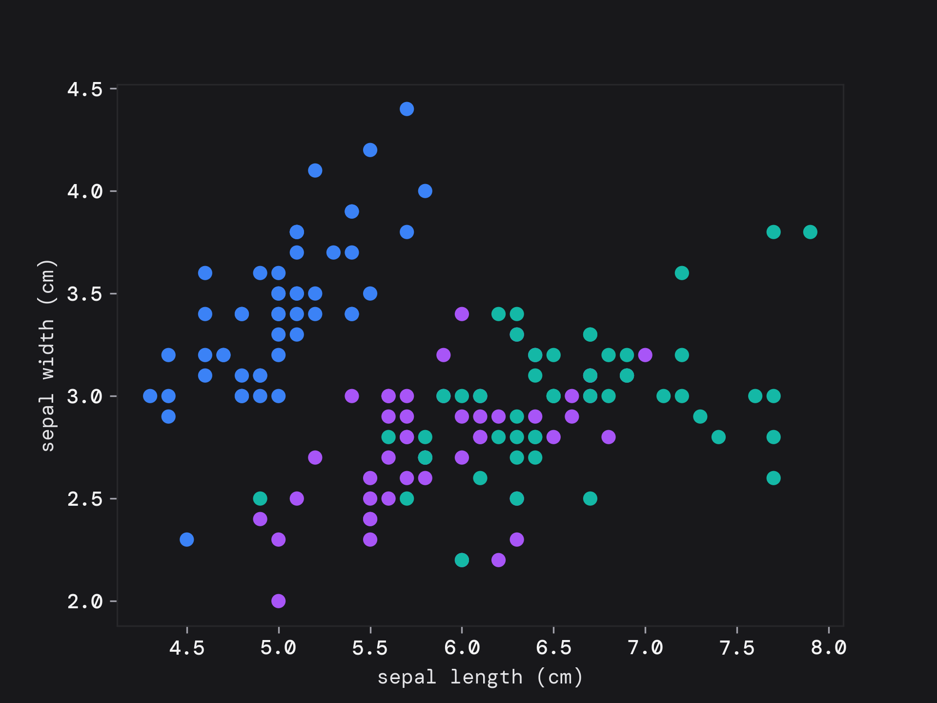
import numpy as np
import matplotlib.pyplot as plt

cycle = plt.rcParams['axes.prop_cycle'].by_key()['color']
_, ax = plt.subplots()
scatter = ax.scatter(iris.data[:, 0], iris.data[:, 1], c=[cycle[x] for x in iris.target])
ax.set(xlabel=iris.feature_names[0], ylabel=iris.feature_names[1])

plt.show()
Histogram
A histogram of the distribution of heights.
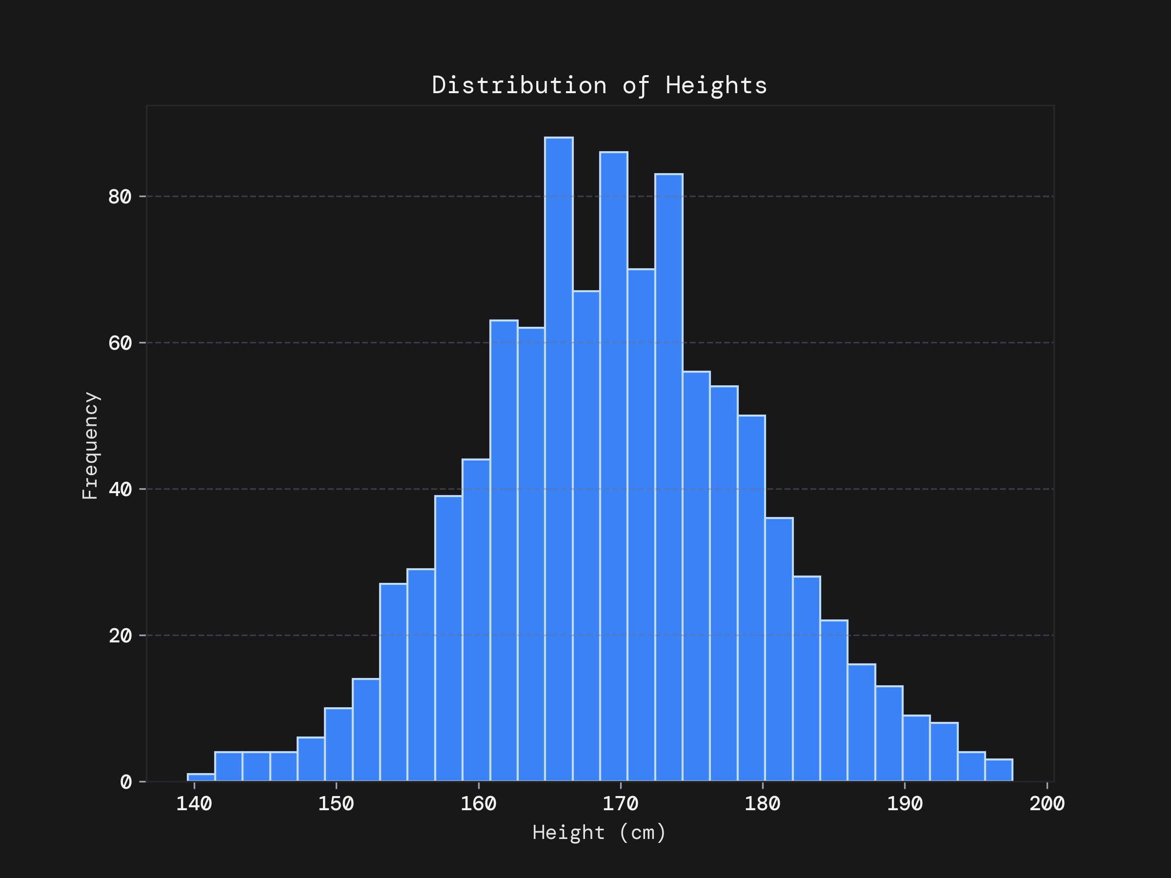
import numpy as np
import matplotlib.pyplot as plt

np.random.seed(0)
heights = np.random.normal(170, 10, 1000)

# Plotting the histogram
plt.figure(figsize=(8, 6))
plt.hist(heights, bins=30, edgecolor='#BFDBFE')

# Adding labels and title
plt.title('Distribution of Heights')
plt.xlabel('Height (cm)')
plt.ylabel('Frequency')

# Adding gridlines for better readability
plt.grid(axis='y', linestyle='--')
plt.show()
Pie Chart
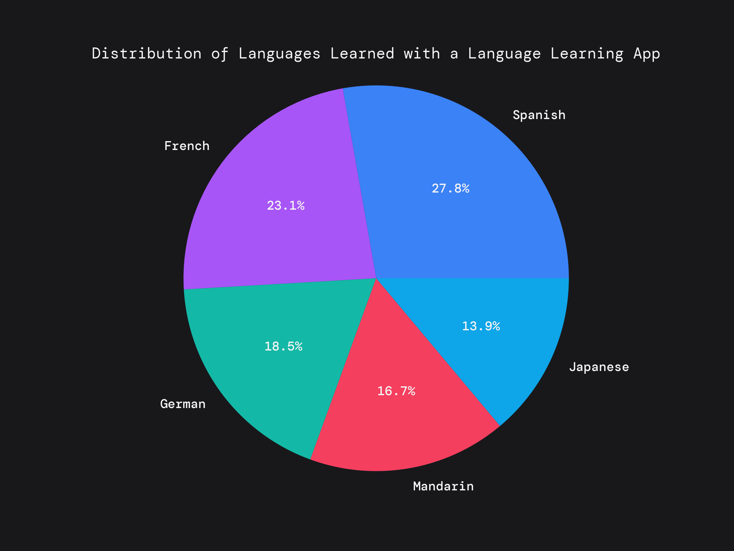
import numpy as np
import matplotlib.pyplot as plt

# Language distribution data
languages = ['Spanish', 'French', 'German', 'Mandarin', 'Japanese']
learners_count = [3000, 2500, 2000, 1800, 1500]  # Example number of learners for each language

# Plotting the pie chart
plt.figure(figsize=(8, 6))
plt.pie(learners_count, labels=languages, autopct='%1.1f%%')

# Adding title
plt.title('Distribution of Languages Learned with a Language Learning App')

# Equal aspect ratio ensures that pie is drawn as a circle
plt.axis('equal')

# Display the plot
plt.savefig('piechart.png')
Installation and Extra Customization
You only need to have the url to use the stylesheets.
These stylesheets use monospace fonts, first giving DM Mono and monospace as a fallback.
To install DM Mono:
- download from google fonts
- install the font locally.
- clear your matplotlib cache:
rm -r ~/matplotlib - (optional) if you are using a python notebook, restart the kernel and re-import
matplotlib.pyplot
To customize this to use a completely different font use the following:
plt.rcParams["font.family"] = "sans-serif"
Available Styles
First we will look at the dark mode styles and then the light mode styles. Since I understand that these may need to go on papers and reports where the background is white.
zinc
Use this snippet:
import matplotlib.pyplot as plt
plt.style.use('https://pltstyle.s3.eu-west-1.amazonaws.com/zinc.mplstyle')
gray
Use this snippet:
import matplotlib.pyplot as plt
plt.style.use('https://pltstyle.s3.eu-west-1.amazonaws.com/gray.mplstyle')
slate

Use this snippet:
import matplotlib.pyplot as plt
plt.style.use('https://pltstyle.s3.eu-west-1.amazonaws.com/slate.mplstyle')
stone
Use this snippet:
import matplotlib.pyplot as plt
plt.style.use('https://pltstyle.s3.eu-west-1.amazonaws.com/stone.mplstyle')
light gray
Use this snippet:
import matplotlib.pyplot as plt
plt.style.use('https://pltstyle.s3.eu-west-1.amazonaws.com/light-gray.mplstyle')
Was this article useful ?
Follow me on social media to get notified of more useful stuff.